

Bouquemized
As a part of my Coursera design project , I was asked to design a Bouquet preview app ,that would help people book flowers flawlessly.

Project overview
product
This product is regarding a bouquet preview app which will enable customer to customize their own bouquets easily.
duration
2nd May - 23rd June

The problem
Almost all the Bouquets ordering or previewing app has almost the same kind of interface and design lacking creativity and experiment . I want to create a simple app design which will enable users to customize their own bouquets.
The solution
Creating a one go app with simple and easy customization which will enable users to personalize their bouquets according to the preferences, and thus adding warmth to the overall experience.
my role
UX designer , UX Researcher ,UI designer
Responsibility
Responsible for designing the app , research & visualization.

Understanding The User
01
User Research
02
Persona
03
Key insight
04
User Journey Map
User Research
I conducted Primary research by surveys , in order to gain an understanding of the Product .

"Always keep that happy attitude. Pretend that you are holding a beautiful fragrant bouquet"
- Earl Nightingale
Research Summary -
As per the survey which was conducted with 8 participants almost 63% of them wanted a app that can customize their bouquet . The participants were based in sub urban and urban areas in India .

" Finally some one thought of that , I really like a personalized gifts and its irritating that customizing bouquets are so rare".
"I hope this has regular option too, you know less is more".
Graph showing 62.5 % response of participants have customization anticipation.
Personas

Name : Anupama
Age : 31 y/o
Hometown : Siliguri, West Bengal
Family : Married , 1 Kid
Occupation : Financial Analyst
“I am a full time working mom with a big family what I want is everything perfect but with minimal time ”
Goals
Frustration
-
To customize bouquets with
minimal effort.
-
Be efficient
-
Make small changes everyday
-
Not satisfied with flowers quality
-
She want's everything simple and quick
-
Not able to identify her needs
Bio
Anupama has M.sc in finance and works as a lead . She is a mother to a to a toddler . Anupama has big family which means many occasions ,her busy day , she wants an easy going app that can customize a bouquet without much energy , so that she can add warmth to her special ones by customizing accordingly.

Name : Kiran
Age : 22 y/o
Hometown : Siliguri, West Bengal
Family : Single, lives with parents
Occupation : Marketing intern
" I like to maintain every beautiful things may it be relations or flowers"
Goals
-
To land a marketing job
-
To own care manuals for flowers
-
To maintain special flower
Frustration
-
Unable to maintain bouquets
-
overwhelmed with varieties
-
Impatient with deliveries
Bio
Kiran is a graduate from Global business management ,she has lots of friends and colleagues , she thinks bouquets are best way to make you feel warm . She wants a app that can give her bit insight about maintaining a bouquet for extra day.
Key Insight
Throughout my research , I discovered that users have core needs for a customization of bouquets


Bouquets care tips
Easy customization
The first step is easy customization , users doesn't want customization that is difficult to tasked.
Users want to have a note specifying what "care tips " for the bouquets they order.
User Journey Map
The below journey map was created by keeping in how a user would go around an bouquet app in order to order a bouquet from their favorite store.

Ideation
Paper wireframe
This is first wireframe which I created on the basis of my research , this is the first paper wireframe. The wireframes consist of total of 8 paper wireframes { Home > customization>Finalizing of bouquets>current orders> checkout confirm order>Final checkout > confirmation}


Home screen- lo-fi
The first frame of the app is designed , keeping the research reference in mind , it has basic feature like:
-
Search menu
-
Customizing menu
-
and regular bouquets

Search option
Customization Menu
Regular bouquets
Usability study findings
After the first & round of usability study, below are the insight I gathered.
Usability 1st round findings
-
User felt that the "select your " page is too clustered.
-
User also want an option to edit their orders
Usability 2nd round findings
-
Users felt that they would have expected some other more clear labels beside 'next'.
-
Users also wants an option to add multiple address
-
Users wanted to view order after ordering.
Ideation After first usability study

According to the first prototype testing , User said that they felt that the design was tacky and confusing , therefore the I designed a revised version of the main flowchart which is crucial for my design . The revised design enable users to have better visual appearance than the prior.
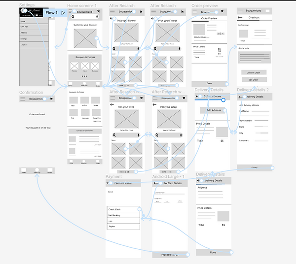
Lo-fi prototype
This in lo-fi digital wireframe created on Figma, this the basic first wireframe, few iteration were done in hi-fi prototype. For the work link of the wireframe click
High Fidelity ideation & prototype
As per the findings of hi-fi prototype usability studies below are some iteration made based on user feedback.( Among the three findings , I showed only as exclusive iteration , the other two is implemented in main mockup and prototype).
Mockups
Early stage of design showed only one option to add address whereas after the usability study , I added a option to add multiple address to allow few variable to the user experience.
Before usability study
After usability study


Key mockups


Hi-fi Prototype
The high fidelity prototype has cleaner user flow for customizing a bouquet . It also mets user need to review their order ,add multiple address and clear navigation buttons.
Link to hi-fi prototype is

Accessibility consideration
Provide access to users who are visually impaired through adding alt to image for screen readers
Used icons to help make navigation easier
Detailed imagery for flowers and bouquets to help all user understand the design
Takeaways
Impact
The app makes users feel like bouquemized app really thinks about how to meet their needs.
One quote from peer feedback:
"The app made it so easy and fun to build my own custom bouquet! I would definitely use this app as a go-to for bouquets, its easy and exciting.
What I learned :
While designing the app , I learned that the first ideas are just beginning phase. With peer feedback and usability study their is always a scope for iteration and is always a ongoing process.
Next Steps
Conduct another round of usability study and validate whether user pain points are addressed or not.
Conduct user research to determine if their are any other areas of need.
Let's connect !
Thank you for your time reviewing my work on my Bouquemized app! If you'd like to see more get in touch, my contact information is provided below.